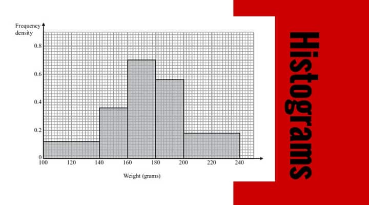
Histogram questions
appear on many GCSE Mathematics exam papers and you can download some example questions from here. They can be a little challenging and please do practice all of the problems – here’s the link to the answers.
Histograms are used quite a lot in statistics and are really just a more sophisticated type of bar chart. The difference is that a histogram shows ‘continuous’ data and there aren’t any gaps between each of the bars. If you were creating a display of ages of children you would tend to use a histogram, as age continues.
A bar chart represents ‘discrete’ information – each bar is on its own. A typical use would be items sold (vertical axis) on each day of a week (along the bottom axis).
[easyazon_image align=”none” height=”160″ identifier=”1844198049″ locale=”UK” src=”https://www.3minutemaths.co.uk/wp-content/uploads/2016/05/51D0Sa98XHL.SL160-3.jpg” tag=”matwra-21″ width=”113″]
Top Tips!
The main things to remember when working with histogram questions are:
– Learn the formula ‘frequency density = frequency / class width
– Pretty much anything else goes from there!
– Remember that ‘frequency density’ is always on the vertical axis and ‘class width’ is always on the horizontal axis
– Try to construct your diagram in such a way that it doesn’t look too squashed
Here’s a ‘cheat sheet’ to download – it might help with your revision
If you’d like to ask for any more detail, or you’re not sure about anything, please do ask a question in the comments section.
All best with your studies 🙂
[easyazon_image align=”none” height=”160″ identifier=”1910602132″ locale=”UK” src=”https://www.3minutemaths.co.uk/wp-content/uploads/2016/05/4128o11qTYL.SL160.jpg” tag=”matwra-21″ width=”108″]
Watch on YouTube:
How to work with histograms – easy crib cheat sheet for GCSE maths
Histograms – GCSE mathematics question 1
Leave a Reply